2026 Wedding Color Trends: Unlock the Power of the ‘All the Colors’ Palette to Create a Stunning, Personalized Celebration
Planning a wedding is an exciting journey filled with countless creative decisions, and choosing the perfect color scheme is often one of the most challenging. Many brides feel limited by traditional palettes, craving something that truly reflects their unique style. With the 2026 wedding color trends embracing the vibrant ‘All the Colors’ approach, couples can now break free from conventional norms and explore a bold spectrum inspired by fine art and interior design. In this expert guide, we will walk you through how to craft a memorable multi-color palette, practical tips for combining colors seamlessly, and ideas to transform your wedding stationery and décor. Ready to redefine your wedding colors? Discover more at https://margoandbees.com/.
Understanding the 2026 Wedding Color Trends: The Rise of Multi-Color Palettes
Breaking the Mold of Traditional Wedding Colors
For years, wedding color palettes have gravitated toward muted pastels or soft neutrals. The 2026 trend ushering in a vibrant, multi-spectral approach allows couples to infuse personality and artistic flair into their ceremonies. This shift moves beyond monochromatic or dual-tone schemes, offering a fresh, inclusive palette that celebrates diversity and creativity.
Inspiration from Fine Art and Interior Design
Drawing from contemporary art movements and interior color theories, the ‘All the Colors’ trend encourages mixing unexpected hues that evoke emotion and visual interest. Think of how painters blend contrasts to create depth or how modern interiors combine rich colors for harmony and energy—this same philosophy transforms wedding design into an experiential statement.
Why This Trend Resonates with Modern Couples
The expressive power of color speaks to couples who see their wedding as a canvas reflecting their individuality. Vibrant palettes symbolize joy, optimism, and connection—perfect sentiments for such a meaningful occasion.
How to Choose and Combine Colors for a Cohesive Wedding Look
Understanding Color Theory Basics
Every successful multi-color palette begins with a grasp of color theory. Complementary colors (colors opposite each other on the wheel) create striking contrasts, while analogous colors (neighbors on the wheel) blend harmoniously. For 2026 weddings, balancing bold contrasts with unifying undertones ensures visual cohesion without overwhelming guests.
Selecting Your Base and Accent Colors
Start by choosing one or two primary colors that resonate with your theme or season. Add supporting shades that provide depth and texture. For example, a base of rich cobalt can be paired with softer blush, amber, and sage accents to build sophistication.
Testing Combinations in Real Life
Swatches and mock-ups are invaluable. Bringing your colors into physical form—through fabric samples, paint chips, and digital tools—helps you visualize the interplay of colors under different lighting conditions.
TIP: Experiment with varying intensities of the same hue to add dimension without cluttering your palette.
Integrating Multi-Color Palettes into Wedding Stationery
Invitations That Set the Tone
Wedding invitations are the first impression of your event’s aesthetic. Incorporate your chosen multi-color palette using sophisticated printing techniques such as watercolor washes, gradient fades, or foil stamping to create dynamic, eye-catching designs that preview your vibrant celebration.
Beyond Invitations: Coordinated Paper Goods
Extend your palette to save-the-dates, RSVP cards, menu designs, and place cards. This cohesive approach enhances the guest experience and reinforces your wedding’s artistic vision.
Using Color Emotion to Guide Design Choices
Colors can evoke feelings—from calm and romance with lavender and peach, to excitement and festivity with coral, teal, and gold. Be intentional about the atmosphere each color introduces and align your stationery accordingly.
Decor and Table Settings Inspired by the ‘All the Colors’ Approach
Mixing Textiles and Floral Arrangements
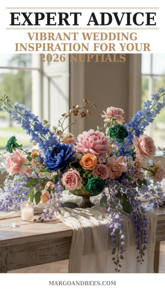
Bring your palette to life with diverse textures and natural elements. Draped fabrics in multiple shades, layered table linens, and eclectic floral groupings enhance the sensory appeal and visual movement across the venue.
Balancing Colors for Photo-Ready Spaces
When working with bold color schemes, it’s important to distribute tones evenly and avoid clashing. Use neutral backdrops or subtle metallic accents to anchor the vibrant hues for stunning photography.
Personalizing with Unique Details
Consider custom signage, colorful glassware, or multi-tone candles. These elements contribute to a cohesive, intentional aesthetic that guests will remember.
Examples of Trending 2026 Color Combinations and Their Emotional Impact
Warm Jewel Tones: Ruby, Emerald, and Amber
This palette conveys luxurious warmth and timeless elegance. It’s ideal for autumn or winter weddings where rich, saturated colors create an intimate atmosphere.
Soft Pastels Meets Bold Pops: Lavender, Coral, and Chartreuse
Playful yet sophisticated, this blend balances softness with energy—perfect for spring or summer celebrations with a modern twist.
Multichromatic Earth Tones: Terracotta, Olive, Mustard, and Navy
Inspired by nature, these grounded tones provide a calming yet dynamic palette for couples seeking a rustic, bohemian vibe.
Case Study: Implementing the Multi-Color Theme with Meaningful Cohesion
Step-by-Step Palette Development
A successful wedding color story starts with moodboarding—curating images, textures, and paints that inspire you. From there, refine your choices to a harmonious set of 5-7 colors that can be consistently integrated.
Collaborating with Vendors
Share your color palette early with your stationer, florist, and decorator. This collaboration ensures all components align, minimizing surprises and maintaining style integrity.
Emphasizing Flexibility
Allow room for subtle variations; some colors look different in fabric than on paper or flowers. Trust vendors’ expertise to adapt your palette practically while respecting your vision.
When and How to Place Orders to Capture 2026 Color Trends
Timing Your Stationery Orders
To fully embrace the 2026 trends and ensure customization flexibility, consider ordering wedding paper goods at least 4-6 months in advance. This lead time allows for proofreading, sampling, and color adjustment.
Budgeting for Multi-Color Design
While a complex palette may increase printing costs, investing in personalized, creative designs adds lasting value to your wedding memories. Ask your stationer about affordable options that incorporate multiple colors elegantly.
Making Informed Decisions with Expert Advice
Consult with experienced designers who specialize in multi-color schemes and wedding trends. This can save time and guarantee that your wedding aesthetic is both current and timeless.
If you’re inspired to create a vibrant, personalized wedding experience, explore how to bring the 2026 wedding color trends to life with multi-color stationery and decor options that speak your unique style.
FAQ
How do I choose the right colors for my wedding?
Start by considering your season, venue, and personal preferences. Use color theory principles to balance harmony with contrast, and don’t shy away from testing physical samples to see how hues interact.
I’m worried that using many colors will look chaotic. How can I avoid that?
Maintain cohesion by selecting a limited palette of 5-7 colors, balancing bold and neutral tones, and using consistent motifs throughout your decor and stationery.
When should I place my order for multi-color wedding invitations?
Ideally, orders should be placed 4-6 months before the wedding date to allow ample time for customization, proofs, and delivery.
How much does it cost to have multi-color wedding stationery designed?
Costs vary depending on materials and printing techniques. Discuss your budget upfront with your stationer to find options that maximize impact and value.
Can I incorporate these color trends if my venue has a strong color scheme?
Yes, the ‘All the Colors’ trend is versatile. Use complementary shades or neutral tones to blend your palette harmoniously with your venue’s existing colors.
What emotions do different color combinations evoke at weddings?
Colors convey a spectrum of emotions—from calm and romantic to lively and festive. For example, jewel tones suggest richness, pastels evoke softness, and earth tones promote tranquility.
Embrace the bold creativity of the 2026 wedding color trends by designing your personalized palette, and create a celebration that truly reflects your story. Discover more inspiration and expert stationery options at https://margoandbees.com/.
#wedding #bridetobe #weddinginvitations #weddinginspo #weddingdecor #2026weddingtrends #weddingcolors #multicolorwedding

