Planning a wedding can feel overwhelming, especially when it comes to choosing the perfect color palette that reflects your style and sets the right mood. As wedding trends evolve, 2026 brings a fresh wave of vibrant and innovative color combinations that break away from traditional norms. Drawing inspiration from fine art and interior design, couples are now embracing bold multi-color palettes that create unforgettable wedding experiences. In this post, you will learn expert tips on incorporating hot pinks, luxurious greens, and sophisticated browns into your wedding stationery and decor to craft a harmonious and eye-catching aesthetic. Ready to transform your wedding vision? Explore the latest collections and start designing your dream invitations today.
Understanding the Shift in Wedding Color Trends for 2026
From Two-Color Themes to Multi-Color Masterpieces
In previous years, minimalist two-tone palettes dominated wedding designs, favoring simplicity and ease of coordination. However, 2026 welcomes a new era characterized by bold, diverse color combinations that borrow heavily from fine art’s vivid palettes and the rich tones often found in contemporary interior design. This shift invites couples to explore dynamic contrasts and layered color stories that enhance every aspect of the wedding atmosphere.
Why Multi-Color Palettes Are Trending Now
The move towards multi-color palettes is partly driven by a desire for personalization and uniqueness. In a world craving authenticity, couples want their weddings to stand out with distinctive hues that resonate emotionally. Moreover, the abundance of inspiration from global art movements and eco-conscious design encourages mixing colors to reflect natural vibrancy and cultural richness.
Key Influences Behind 2026 Color Choices
Art movements such as Post-Impressionism and Abstract Expressionism inspire the playful use of color contrasts, while Scandinavian and Japanese interior designs inform balance and harmony within bold color use. These influences make it easier to merge seemingly contrasting colors like hot pink and dark browns without overpowering the overall wedding look.
Top Colors Defining the 2026 Wedding Palette
Hot Pink: The Unexpected Hero
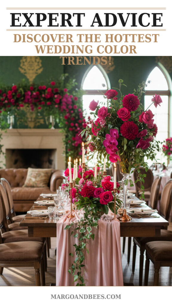
Hot pink is one of 2026’s standout colors—vibrant, energizing, and perfect for couples wanting to break conventions. This color conveys passion and joy, making it ideal for statement floral arrangements, bridesmaid dresses, or accent details on invitations.
Luxurious Greens: Sophistication Meets Nature
From deep emerald to soft sage, luxurious greens bring an organic richness to wedding palettes. These tones ground bold hues like hot pink and add a calming influence perfect for table settings, foliage, and printed stationery designs.
Sophisticated Browns: Warmth and Elegance
Gone are the days when brown was reserved for rustic weddings alone. This year, warm browns act as a chic neutral base that adds depth and elegance. Use it for typography on invitations or as part of your decor fabrics for a timeless appeal.
How to Design a Balanced Multi-Color Palette for Your Wedding
Start with a Dominant Base Color
Select one color to serve as the anchor for your palette. For 2026 weddings, this could be a luxurious green or a sophisticated brown. This foundation keeps the palette cohesive and guides the application of accent colors across your paper goods and decor.
Add Two to Three Accent Colors
Next, introduce vibrant accents like hot pink or complementary shades from nature to create visual interest. Too many colors can overwhelm, so limiting yourself to three or four total helps maintain balance while embracing boldness.
Utilize Different Shades and Textures
Layering different tones—such as a mint green with (emerald) deep green or a blush pink with hot pink—adds dimension. Textural contrasts in paper finishes or fabric choices can also enhance how colors appear in physical settings and stationery.
Incorporating the Palette into Wedding Invitations and Paper Goods
Color Blocking and Patterns
Multi-color palettes thrive with thoughtful use of patterns and color blocking on invitations, save-the-dates, and menus. Geometric shapes or floral motifs printed in your chosen palette can make your paper goods visually dynamic and unique.
Typography and Color Contrast
Effective typography uses color contrast for readability and style. For instance, brown typography on a hot pink background creates elegance and energy, while green accents soften the look. Prioritize legibility alongside aesthetic appeal.
Coordinating Save-the-Dates and RSVP Cards
Ensure consistency by carrying your color palette through all paper items. This cohesive approach supports your wedding theme and offers guests a preview of your colorful celebration.
Suggestions for Applying the 2026 Palette to Wedding Decor
Floral Arrangements and Greenery
Work with florists to integrate bold colors like hot pink blooms combined with lush greenery. Mixing these elements brings vibrancy and natural elegance to ceremony and reception spaces.
Table Settings and Linens
Choose linens and tableware in sophisticated browns or greens, accented by napkins or centerpieces featuring hot pink details. This approach ties your palette visually with the guest experience.
Lighting and Ambience
Warm lighting enhances the richness of your multi-color palette. Consider colored uplights or candles with tinted holders matching your palette to create atmospheric charm.
Expert Tips for Couples: Balancing Boldness with Cohesion
Test Your Palette in Different Lights
Colors can shift based on lighting and surrounding elements. Request samples of paper stocks and fabrics, and observe them in natural and artificial light to ensure harmony.
Maintain Visual Breathing Space
Use white or neutral spaces to balance intense colors. This prevents visual fatigue and allows your chosen colors to stand out gracefully.
Consult a Professional Designer
If unsure, working with a wedding planner or designer experienced in color theory can optimize your palette for maximum impact and coordination.
TIP: Incorporate your multi-color palette early in your wedding planning, starting with invitations at Margo & Bees, to set the tone for a cohesive celebration.
Frequently Asked Questions
How do I choose the right multi-color palette for my wedding?
Begin by considering your personal preferences and the setting. Use one dominant color as a base and add complementary and contrasting accents inspired by art or nature to create balance.
When should I order invitations to reflect my 2026 color palette?
Order your invitations at least 3-4 months before the wedding date to allow ample time for designing, printing, and mailing. Visit Margo & Bees for timely inspiration and ordering.
Can multiple bold colors be used without overwhelming guests?
Yes, by balancing bold colors with neutrals, varying textures, and maintaining visual breathing room, your palette can remain vibrant yet elegant.
How much does incorporating a multi-color palette into stationery typically cost?
Costs vary based on paper quality, printing techniques, and design complexity. Custom multi-color designs may be slightly higher but offer unmatched personalization. Explore pricing options at Margo & Bees.
What are some creative ways to use the 2026 palette outside invitations?
Consider using your colors in signage, seating charts, favors, and even bridesmaid accessories to extend your theme throughout the event.
Final Thoughts: Embrace 2026’s Wedding Color Trends at Margo & Bees
The 2026 wedding season invites you to explore the freedom of bold, multi-color palettes inspired by art and design. By thoughtfully combining hot pinks, luxurious greens, and sophisticated browns, you can create wedding stationery and decor that delights guests and expresses your unique love story. Don’t hesitate to start crafting your perfect palette — discover exquisite multi-color invitations and paper goods at Margo & Bees and make your big day truly unforgettable.
#wedding #bridetobe #weddinginvitations #weddinginspo #weddingdecor #weddingcolors #2026weddingtrends #multicolorpalette

