Top Wedding Color Trends for 2026: Set the Tone for Your Big Day with Fine Art Inspiration and Bold Hues
Planning your wedding and searching for the perfect color palette can feel overwhelming. Many couples desire a unique, beautiful celebration that truly reflects their style and personality. With so many options, understanding the latest wedding color trends for 2026 can help you make confident, inspired choices. This post will explore the shift towards fine art-inspired tones and interior design-adjacent shades, including the resurgence of bold colors like hot pink and lush greens. You’ll discover how these colors influence everything from invitations and stationery to décor and table settings. Ready to design your dream wedding? Explore stunning ideas and practical tips now, and find inspiration for your big day at Margo and Bees.
Understanding the Shift: Fine Art-Inspired Tones in Wedding Colors
What Are Fine Art-Inspired Tones?
Fine art-inspired tones are subtle, sophisticated shades that evoke feelings of timeless elegance. These colors often feature muted palettes, with dusty blues, soft blushes, warm neutrals, and gentle greys. Think of watercolor paintings or impressionist masterpieces — their gentle, refined aesthetics are redefining wedding color schemes for 2026.
Why Are These Tones Trending in 2026?
The demand for weddings that feel both modern and timeless has led to the rise of these refined palettes. Couples are drawn to colors that mimic the layers and textures found in fine art, creating an atmosphere that’s tranquil and inviting. These shades integrate beautifully with natural elements and sustainable décor trends, perfect for couples seeking understated luxury.
Incorporating Fine Art Hues Into Your Wedding
Start with your invitations and stationery to set the tone early. Margo and Bees offers beautifully crafted paper goods that utilize these delicate colors to create a cohesive look. Pair your palette with muted linens, natural flowers, and artistic décor elements for a serene ambiance.
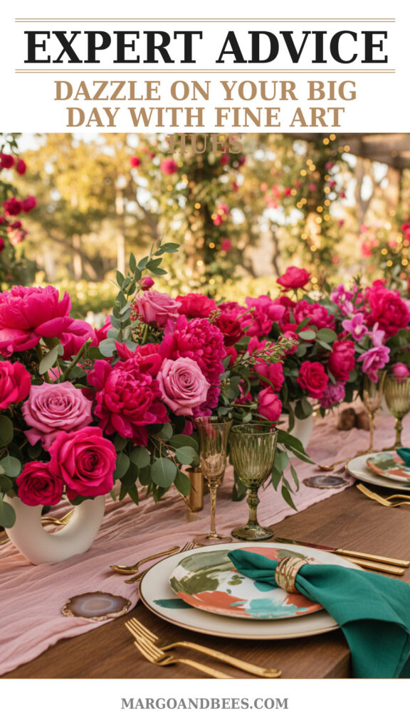
The Bold Comeback: Hot Pink and Luxurious Greens
Why Bold Colors Are Gaining Popularity
Contrary to the muted trend, 2026 also introduces a bold color resurgence, particularly hot pink and deep greens. These hues bring vibrancy, passion, and energy, providing a striking contrast to softer tones. They inject excitement and make a bold personal statement.
Using Hot Pink Effectively
Hot pink can be a focal point or an accent. It works wonderfully in floral arrangements, statement bridesmaid dresses, or table décor details. To avoid overwhelming your design, balance hot pink with neutral or earthy tones for an elevated, intentional look.
Elevating Your Wedding with Luxurious Greens
Luxurious greens such as emerald, forest, and olive create a lush, rich backdrop that complements virtually any theme. These shades bring depth and sophistication and are perfect for greenery-heavy installations like arches, garlands, or elegant table runners.
How Wedding Color Trends Influence Stationery and Invitations
Setting Expectations with Invitations
Your wedding invitation is the first glimpse guests get of your celebration’s color story. Incorporating trending colors here helps build anticipation and cohesion. Whether you choose fine art tones or bold pops of color, invitations set the mood for your entire event.
Coordinating Table Settings and Favors
Extend your color palette to table linens, chargers, and favor packaging. Using colors consistently across stationery and décor creates a harmonious and polished experience. Consider subtle touches like menus, place cards, or personalized thank you notes in your chosen hues.
Design Tips for Multi-Color Palettes
Creating a multi-color palette can be tricky. Start with one dominant color, then choose 2-3 complementary tones. Incorporate varying shades and textures to maintain interest without visual overload. Tools like mood boards or color palette generators can help visualize your choices. Visit Margo and Bees for inspiration and stationery options that can align with these complex palettes.
TIP: Using metallic accents such as gold or copper with your color scheme adds a layer of elegance and modernity, perfect for both fine art-inspired and bold color palettes.
When and How to Order Your Wedding Stationery
How Early Should You Place Your Order?
To avoid stress, plan your stationery orders 4-6 months before the wedding date. This timeline allows for design proofs, adjustments, and shipping time. Early ordering helps incorporate any last-minute changes to your color palette or event details.
Choosing Custom vs. Semi-Custom Designs
Custom invitations offer complete personalization but often require longer turnaround times. Semi-custom options, like those at Margo and Bees, provide a great balance between customization and efficiency, allowing you to tweak colors and fonts to fit your 2026 palette.
Cost Considerations for Wedding Invitations
Stationery pricing varies based on materials, printing methods, and design complexity. Premium papers, foils, or embellishments can increase costs but also enhance the luxe feel. Setting a clear budget early helps manage expectations and guides design decisions.
Creating a Cohesive Wedding Look with Your Chosen Colors
From Ceremony to Reception: Color Continuity
Ensure your color palette flows seamlessly from the ceremony space to the reception venue. Repeat your key colors in floral arrangements, bridesmaids’ attire, décor elements, and signage to create an immersive experience for guests.
Incorporating Interior Design Inspirations
2026 trends borrow heavily from interior design, favoring earthy textures and tones that echo modern living spaces. Use textiles like velvet in chairs or drapery, natural wood accents, and ambient lighting to complement your colors and create a warm, sophisticated atmosphere.
Balancing Multiple Colors Without Clashing
Layering multiple colors requires attention to scale and proportion. Use neutrals to ground your palette and balance bold or saturated colors with softer shades. For example, pair hot pink accents with muted neutrals to avoid overwhelming the senses.
How These Trends Enhance Your Wedding Experience
Emotional Impact of Color Choices
Colors influence the mood and energy of your celebration. Softer tones create a calm, romantic vibe, while bold colors energize and excite. Deciding on the right combination helps express your unique love story in visual form.
Ensuring Guest Comfort and Engagement
Color affects guest perception and comfort. Use inviting hues in seating, lighting, and signage to make your guests feel welcome and engaged. Thoughtful color planning supports a memorable, immersive wedding atmosphere.
Personalizing Your Wedding with Trend-Inspired Colors
Incorporating 2026’s top color trends allows you to blend current style with timeless personal touches. Whether through elegant stationery, floral design, or décor accents, these palettes help narrate your story beautifully and confidently.
FAQ
How do I choose the right wedding colors for my style?
Consider your venue, season, and personal preferences. Look at current trends like fine art-inspired tones or bold colors for inspiration, then adjust to what feels most authentic to you.
When should I order my wedding invitations?
Ideally, 4-6 months before your wedding date to allow for design proofing, editing, and delivery. Early ordering ensures smooth planning.
How much do custom wedding invitations typically cost?
Costs vary, but expect $5-$15 per invitation depending on materials and design complexity. Semi-custom options can be more budget-friendly while still offering personalization.
Can I mix bold colors with muted tones in my palette?
Yes, mixing creates visual interest. Use bold colors for accents and muted tones as a base to maintain balance and harmony.
How do wedding color trends influence décor beyond stationery?
Trends affect floral arrangements, linens, lighting, and even tableware. Using consistent colors throughout all elements creates a cohesive and impactful aesthetic.
Choosing your wedding colors is more than decoration — it’s about creating the perfect mood and telling your unique story. Embrace 2026’s inspiring trends by blending fine art-inspired tones with vibrant accents for a celebration that’s truly unforgettable. To start your journey with exquisitely crafted stationery and color ideas, visit Margo and Bees today.
#wedding #bridetobe #weddinginvitations #weddinginspo #weddingdecor #weddingcolors2026 #weddingplanning #fineartwedding #boldweddingcolors

