Planning a wedding in 2026 means embracing the freshest and most vibrant color trends to make your day unforgettable. As a bride-to-be, you want your wedding palette to reflect both your personality and the evolving style norms, moving beyond traditional two-color schemes towards a rich, multi-color approach inspired by fine art and interior design. In this post, we’ll guide you through the latest 2026 wedding color trends and provide expert tips on crafting a cohesive and inspired palette that flows seamlessly from invitations to décor. Ready to bring your dream wedding colors to life? Explore our exclusive collection of wedding invitations and stationery designed to complement these vibrant hues.
Understanding the Shift: From Traditional to Trendy Multi-Color Palettes
The Evolution of Wedding Color Schemes
Wedding color palettes have traditionally revolved around simple combinations—usually two or three colors—to maintain elegance and uniformity. However, 2026 is ushering in a new era where bold and diverse colors create a dynamic, artistic atmosphere. Influenced by fine art and modern interior design, these multi-color palettes are a visual feast that tells a unique love story.
Why Multi-Color Palettes Are Gaining Popularity
Brides in 2026 seek individuality and creativity, expressing their personalities through complex layers of color. This approach adds depth and richness to the overall wedding aesthetic. The blend of various hues allows for more flexibility with décor, florals, and attire, making the wedding visually stunning and fully personalized.
How Interior Design Influences Wedding Colors
Designers and brides alike are looking toward interior décor trends such as muted earth tones, jewel hues, and unexpected color contrasts. This crossover enriches wedding palettes by incorporating sophisticated shades that work well both in stationary and physical spaces like reception venues.
Crafting Your 2026 Wedding Color Palette
Start with a Base: Grounding Elegance
Building a multi-color palette begins with selecting a grounding base color. It often sets the tone and adds cohesion across all elements of your wedding. Consider classic neutrals revised with modern undertones, such as warm greys, muted taupes, or soft pastels.
Incorporate Fine Art-Inspired Accents
Drawing inspiration from impressionist paintings or contemporary art can help you pick vibrant yet harmonious accent colors. Think deep sapphire blues, rich coral reds, and warm marigold yellows mingling effortlessly for an artistic touch.
Balancing Bold Tones with Softer Shades
To avoid overwhelming your guests, balance bold colors with softer hues. This contrast creates visual interest and sophistication, guiding the eye naturally from one detail to the next. Using gradients or ombre effects within stationery can enhance this balance beautifully.
Applying the Palette to Wedding Stationery
Matching Invitations with Your Palette
Your wedding invitations are the first glimpse guests get of your event’s style. Incorporate your color palette subtly or boldly through watercolor washes, foil accents, or layered paper to intrigue and excite. Explore our complete collection of customizable wedding invitations designed with multi-color harmony in mind.
Coordinating Save-the-Dates and RSVP Cards
Consistency is key. Extend your palette across all paper goods, including save-the-dates, RSVP cards, and menus. This unification creates a polished look that carries anticipation from reception to the ceremony.
Using Color Psychology to Set the Mood
Colors deeply influence emotions. Warm colors like coral and marigold evoke happiness and energy, while cool tones such as navy and teal suggest calm and sophistication. Selecting the right colors for your stationery can tip the mood, preparing guests for a memorable experience.
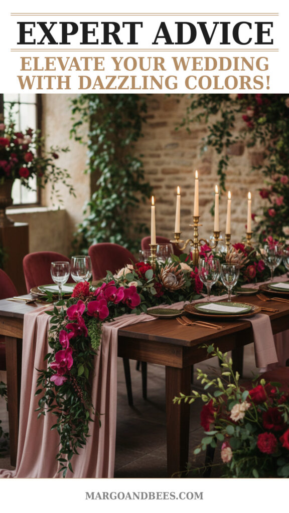
Integrating Color into Reception Décor
Floral Arrangements with Multi-Color Appeal
Flowers are a perfect medium to showcase your palette. Use combinations that reflect your hues without becoming chaotic. A mix of bold blooms with neutral filler flowers keeps arrangements elegant and fresh.
Table Settings and Linens
Linens offer an excellent way to embed color subtly. Alternating napkin colors, layered table runners, or even multi-toned glassware can enhance your theme without overwhelming.
Lighting and Ambiance
Colored lighting can unify your palette and create a dreamy atmosphere. Strategically placed uplights, candles, or chandeliers in your chosen color scheme enhance the overall vibe.
Practical Advice for Brides: How and When to Choose Your Colors
Considering the Season and Venue
Your wedding date and venue significantly influence color decisions. Spring and summer weddings may favor brighter, lighter palettes, while fall and winter lean towards deeper, moodier hues. Ensure your palette complements your location, whether it’s a rustic barn or modern ballroom.
Coordination with Wedding Attire
Discuss your palette with your bridal party so dresses, ties, and accessories align harmoniously with your color scheme. It enhances photos and the overall aesthetic.
When to Order Custom Stationery
To guarantee your stationery matches your colors perfectly, order your invites at least 4-6 months in advance. This timeline accommodates design customization and printing, avoiding last-minute stress.
TIP: Work closely with your stationery designer or choose customizable templates that allow you to tweak color shades to your liking. Visit Margo and Bees for elegant, adaptable designs perfect for your 2026 palette.
FAQ
How do I choose the perfect wedding color palette?
Start by identifying colors you naturally love and consider your venue, season, and overall theme. Use inspiration boards or palette generators online to visualize combinations. Incorporate trending hues for a modern touch, such as the 2026 multi-color trends showcased on Margo and Bees.
How many colors should I include in my wedding palette?
While traditional schemes preferred 2-3 colors, 2026 trends embrace 4-6 colors for a layered, artistic look. Just be sure to balance bold and neutral tones to avoid overwhelming your design.
When should I order my wedding invitations?
Plan to order invitations 4-6 months before your wedding date. This ensures ample time for customizations and printing, and the colors can be fine-tuned to your palette.
How much do custom multi-color wedding invitations cost?
The cost varies depending on design complexity, materials, and printing techniques such as foil or letterpress. Find elegant, budget-friendly multi-color stationery options at Margo and Bees, which offers transparent pricing and customization.
Can I incorporate interior design trends into my wedding colors?
Absolutely! Drawing from interior design adds sophistication and originality. Popular 2026 colors include jewel tones, earthy neutrals, and vintage pastels that can blend beautifully in your wedding palette and invitations.
Final Thoughts: Elevate Your Wedding with 2026’s Bold Color Palette Trends
Choosing a vibrant, fine art-inspired multi-color palette for your 2026 wedding invites bold creativity and timeless elegance. Integrating these colors across all elements—from invitations to décor—crafts an immersive and unforgettable atmosphere. Don’t hesitate to explore the stunning collection of wedding stationery at Margo and Bees that perfectly complements this year’s color trends and helps you design your perfect wedding look.
TIP: Regularly refer back to your palette during planning to maintain color cohesion. Starting with thoughtfully designed stationery sets the stage for beautiful, harmonious wedding visuals.
Embark on your creative journey today and let your wedding colors tell your love story like never before!
Discover the latest 2026 wedding invitations and design your perfect multi-color palette now!
#wedding #bridetobe #weddinginvitations #weddinginspo #weddingdecor #weddingcolors #weddingplanning #2026weddingtrends

