Planning a wedding that truly reflects your unique love story and personality can be both exciting and overwhelming. With so many color palettes emerging, it’s easy to feel stuck choosing the perfect shades that enhance your celebration’s atmosphere. As experts in wedding design and style, we’re here to guide you through the vibrant and sophisticated 2026 wedding color trends, focusing on fine art-inspired tones and bold interior design hues. This post will help you confidently create a cohesive color palette, integrating everything from hot pinks to luxurious greens and sophisticated browns. Ready to make your wedding pop? Start by exploring exclusive design ideas and stationery inspiration at https://margoandbees.com/.
Understanding the 2026 Wedding Color Palette
What Defines Fine Art-Inspired Tones?
Fine art-inspired color palettes draw from classic and contemporary artworks, blending muted, earthy shades with dramatic pops of color. These tones include soft blues, creamy ivories, and muted greens, which provide an elegant and timeless backdrop for any wedding.
Interior Design Influences on Wedding Colors
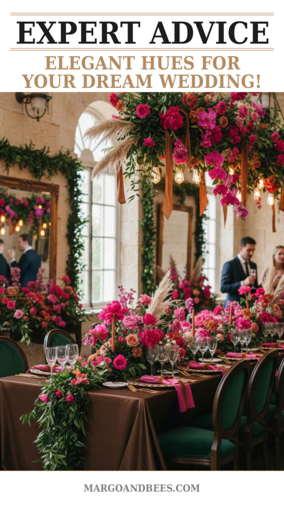
Trends in interior design often dictate upcoming wedding colors. For 2026, expect to see a fusion of warm, sophisticated browns, and bold, luxurious greens coupled with vibrant hot pinks. These colors add depth and personality, creating a memorable atmosphere.
Popular Colors for 2026 Weddings
- Hot Pink: Adds a playful yet bold accent.
- Luxurious Greens: From emerald to forest shades, exuding richness.
- Sophisticated Browns: Warm, earthy, and grounding tones.
How to Build a Cohesive Wedding Color Palette
Start With Your Personal Style
Your wedding colors should be a reflection of your personality as a couple. Begin by identifying shades that resonate with you both emotionally and aesthetically. Are you drawn to vibrant, energetic colors or muted, natural palettes?
Balance and Contrast
Balance bright colors like hot pink with calming greens and browns to avoid overwhelming your guests. Contrasting colors can create visual interest, while similar tones keep the look elegant and consistent.
Incorporate Seasonal and Venue Considerations
When planning your palette, consider the season and venue. For example, bold greens and browns work beautifully in autumn or rustic settings, while hot pinks shine during spring and summer celebrations.
Incorporating 2026 Colors into Wedding Stationery
Choosing Invitations That Speak Louder Than Words
Your wedding invitations are the guests’ first impression of your celebration. Using fine art-inspired tones combined with vibrant hues creates an unforgettable design that sets the tone for your big day.
From Save-the-Dates to Thank-You Cards
Carry your colors through every piece of stationery. Consistent use of your palette in save-the-dates, RSVP cards, menus, and thank-you notes unifies your wedding theme seamlessly.
Material and Finish Tips
Experiment with textured paper, metallic foils, or watercolor prints to enhance your color palette’s richness. These details elevate your stationery and complement the sophistication of the 2026 trends.
Creative Ways to Use Hot Pink in Your Wedding
Accent Florals and Decor
Hot pink works beautifully as an accent color in bouquets, centerpieces, or even bridesmaids’ dresses, adding energy without overpowering the overall look.
Stationery and Paper Goods
Incorporate hot pink in invitation borders, calligraphy, or envelope liners. This bold hue can make your stationery truly stand out.
Accessories and Details
Consider subtle touches such as hot pink shoes, ribbons, or even cake decorations to weave this vibrant color into your celebration.
Why Luxurious Greens and Sophisticated Browns Are Timeless
The Versatility of Greens
Luxurious greens — such as emerald and forest — evoke nature and elegance. They work well for outdoor weddings and provide a refreshing complement to brighter tones like hot pink.
Browns for Warmth and Depth
Sophisticated brown tones add warmth and richness, perfect for grounding your palette. Shades like chocolate, chestnut, or caramel bring a cozy, inviting feel to your wedding décor.
Combining Greens and Browns for a Natural Look
Together, these hues create an earthy, effortlessly chic vibe. Use them in linens, table settings, and even groom’s attire for a harmonious and organic wedding atmosphere.
Expert Tips for Implementing the 2026 Color Trends Into Your Wedding
Start Small and Build
Begin with key pieces—like invitations or bridesmaid dresses—and layer in complementary colors through flowers, décor, and table settings.
Consult with Professionals
Work with planners and designers who understand these trends and can help you curate a palette that feels authentic and visually stunning.
Don’t Be Afraid to Mix Bold and Soft
Combining vibrant hot pinks with muted greens and browns can create a dynamic yet balanced look, reflecting both elegance and playfulness.
TIP: Visit https://margoandbees.com/ to find beautiful stationery collections perfectly tailored for 2026 color trends.
FAQ
How to choose the perfect wedding colors for my personality?
Reflect on your shared tastes and favorite environments. Are you drawn to bold statements or subtle elegance? This guides your color selection.
When should I order my wedding stationery?
It’s best to order your invitations six to eight months before your wedding date to allow time for proofs, printing, and mailing.
How much does it cost to incorporate trendy colors into wedding design?
Costs vary depending on materials and complexity, but integrating trending colors through stationery and décor can be done on various budgets with smart choices.
Can I mix traditional and trendy wedding colors?
Absolutely! Mixing classic neutrals with bold 2026 hues like hot pink adds contemporary flair while honoring tradition.
What are some creative ways to use browns in wedding decor?
Consider wood accents, leather details, or rich chocolate table linens that add texture and warmth.
Why is using a cohesive color palette important?
A cohesive palette ensures consistency, enhances photos, and creates an immersive experience for your guests.
Embrace the dynamic and sophisticated 2026 wedding color trends to create a celebration that is as unique and beautiful as your love story. For stunning stationery ideas and tools to bring your vision to life, visit https://margoandbees.com/ today.
#wedding #bridetobe #weddinginvitations #weddinginspo #weddingdecor #weddingcolors #2026wedding #weddingtrends #fineartwedding

