Explore the latest 2026 wedding color trends that are transforming how couples plan their big day. Discover how fine art-inspired tones, vibrant and expressive hues, and interior design influences are reshaping wedding palettes. Learn how these colors evoke deep emotions and coordinate seamlessly with invitations and save-the-dates, creating a truly cohesive celebration. Whether you’re searching for inspiration or practical tips, this expert guide will help you select a color scheme that reflects your unique personality and enhances your wedding experience. Dive in and start envisioning your perfect day with stunning color ideas from Margo and Bees.
The Rise of Fine Art-Inspired Wedding Colors in 2026
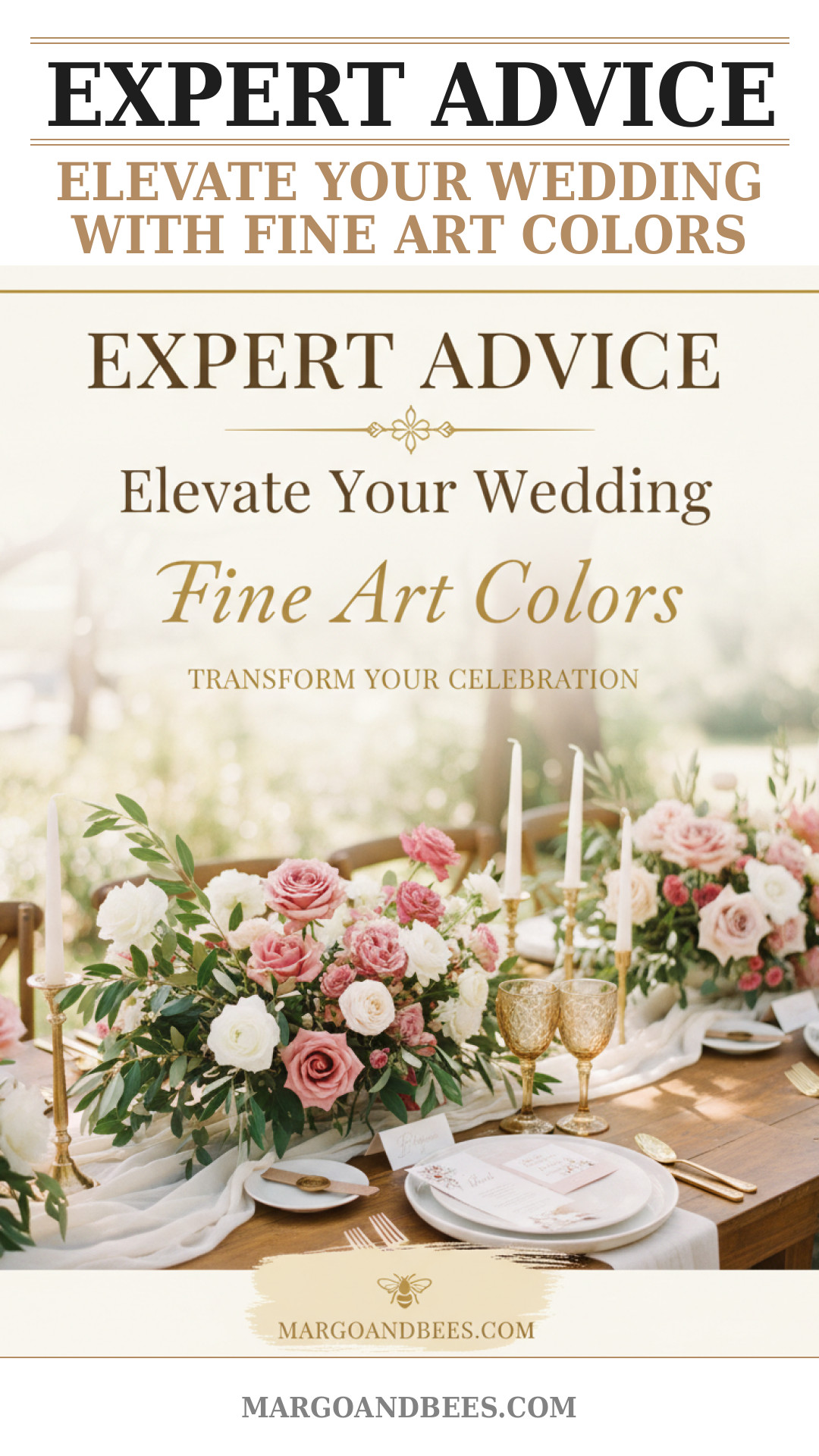
What Are Fine Art-Inspired Tones?
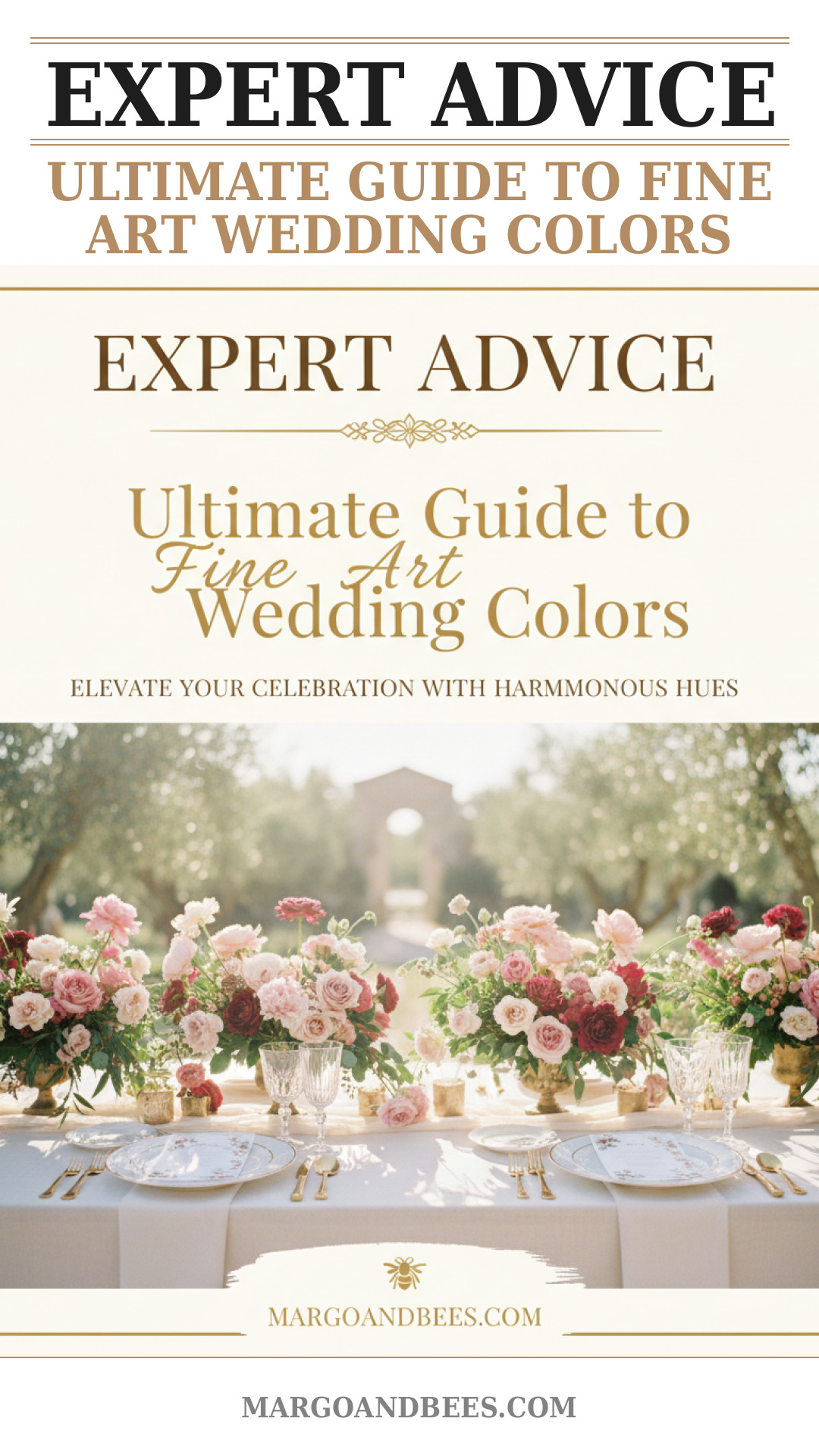
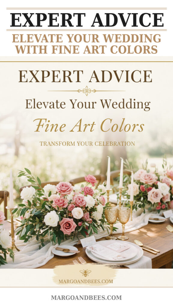
In 2026, wedding color palettes are taking a turn towards the muted, subtle shades reminiscent of classic paintings. Think dusty mauves, soft sage greens, and warm terracotta hues that evoke a timeless sense of elegance.
Why Couples Are Choosing These Colors
These fine art-inspired tones create a sophisticated atmosphere, perfect for couples looking to blend contemporary style with vintage charm. They offer versatility and pair beautifully with natural wedding decor, making the whole event feel curated and intentional.
Incorporating Fine Art Colors Into Your Wedding
From bridesmaid dresses to floral arrangements and stationery, integrating these tones adds depth and harmony to your wedding theme. For elegant invitations and save-the-dates that resonate with this artistic flair, choose designs that emphasize texture and subtle shading at Margo and Bees.
Vibrant and Expressive Hues: Bringing Energy to Your Celebration
Understanding the Emotional Impact of Bright Colors
Vibrant colors like rich fuchsias, fiery oranges, and electric blues uplift the mood and inject personality into your wedding. They stimulate joy and excitement, helping to create unforgettable memories for you and your guests.
Balancing Vibrancy With Elegance
Even bold hues can be sophisticated when paired with neutrals or metallic accents. Consider contrasting a vivid coral bouquet with cream linens or incorporating gold foil accents into your wedding stationery for a luxurious effect.
Where to Use Expressive Colors
Expressive colors work great for statement elements: bridesmaids’ attire, floral installations, and personalized stationery. To find invitation designs that harness these vibrant palettes, visit Margo and Bees for curated collections tailored to 2026 trends.
The Influence of Interior Design on Wedding Color Choices
Blurring the Lines Between Wedding and Home Decor
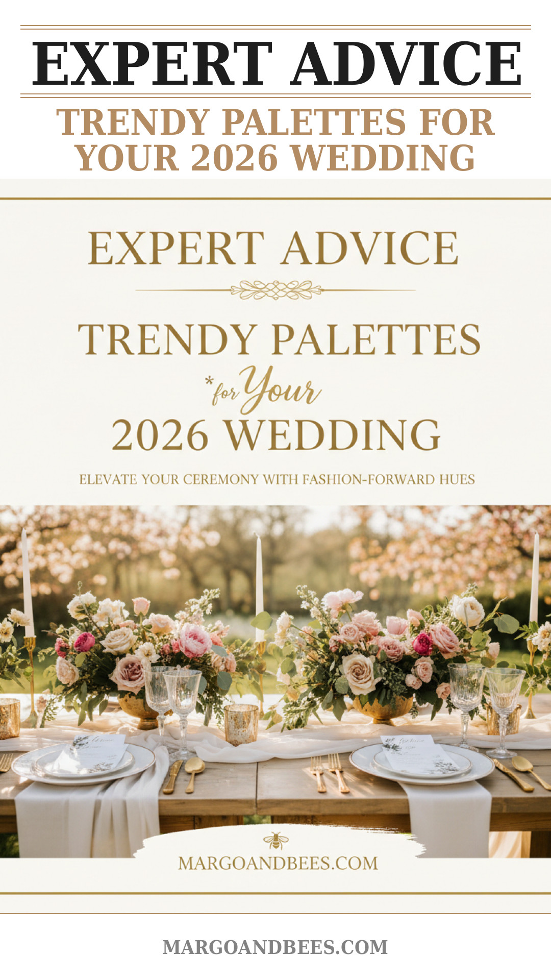
Modern couples increasingly draw inspiration from interior design trends when selecting wedding colors. This includes embracing earth tones, textured fabrics, and layered color schemes popular in contemporary living spaces.
Popular Interior-Inspired Palettes
Muted blue-grays, terracotta, natural greens, and soft blush are dominating both interiors and weddings alike. These colors add warmth and familiarity, creating inviting spaces for your ceremony and reception.
Integrating Interior Design Elements in Wedding Decor
Choose furniture rentals, tableware, and textiles that reflect your color palette. Coordinated invitations and save-the-dates from Margo and Bees featuring these tones create a seamless experience from the first “save the date” to the final toast.
How to Select a Cohesive Color Scheme Reflecting Your Personality
Assessing Your Style and Preferences
Start by listing colors you love and considering what mood you want to set. Are you drawn to calm, understated hues or bold, energetic tones? Your wedding colors should feel authentic and comfortable to you.
Using Color Theory Basics
Learn about complementary, analogous, and triadic color schemes to create balance. For example, pairing a dusty blue with coral and gold accents results in a harmonious yet vibrant palette.
Testing Your Palette
Gather fabric swatches, paint chips, and sample invitations to visualize how the colors work together. The right stationery from Margo and Bees can serve as a perfect color sample and set the tone for the entire event.
TIP: Don’t hesitate to consult your wedding planner or a color expert to refine your palette and ensure your colors look flattering under different lighting conditions on your big day.
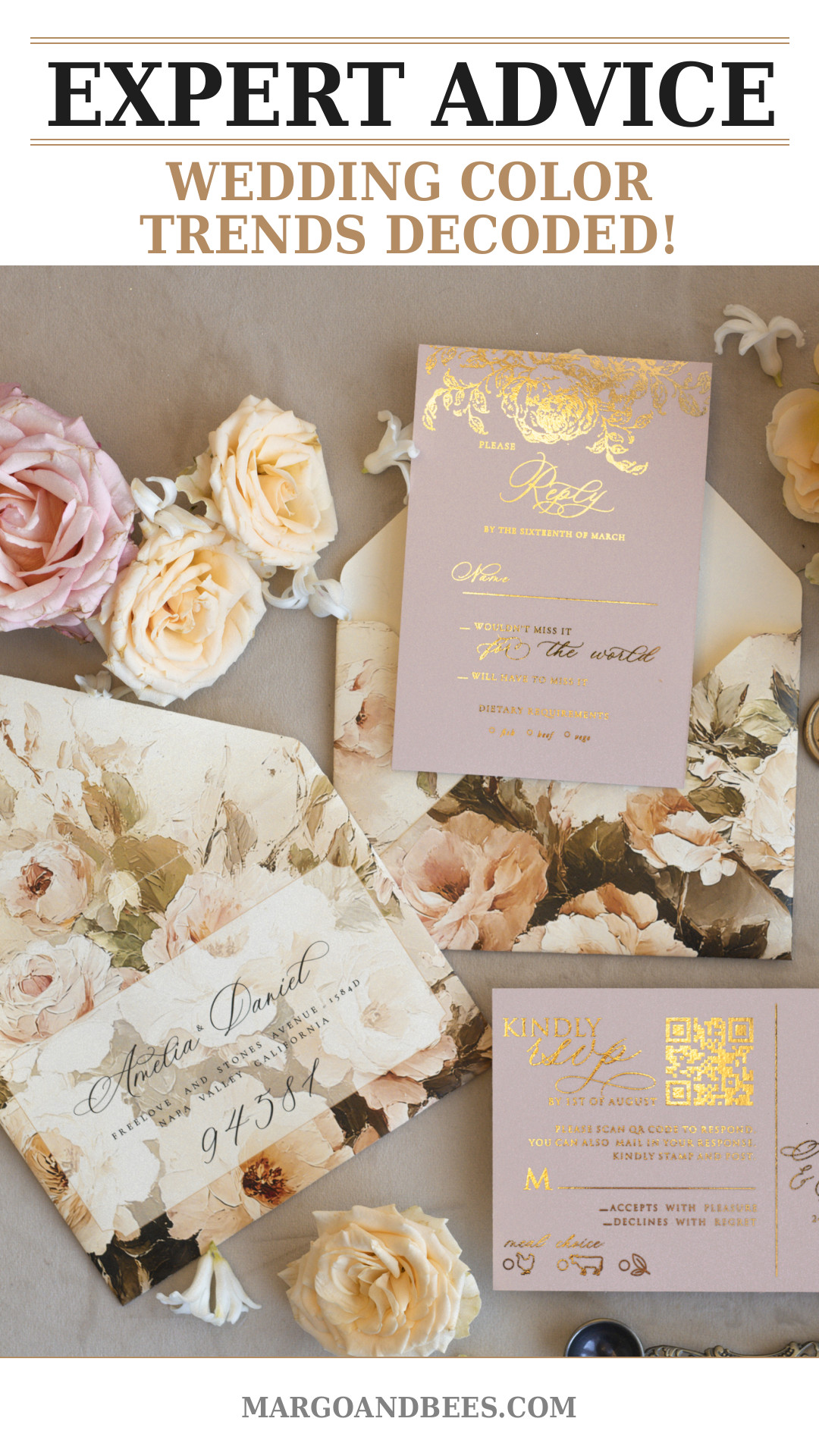
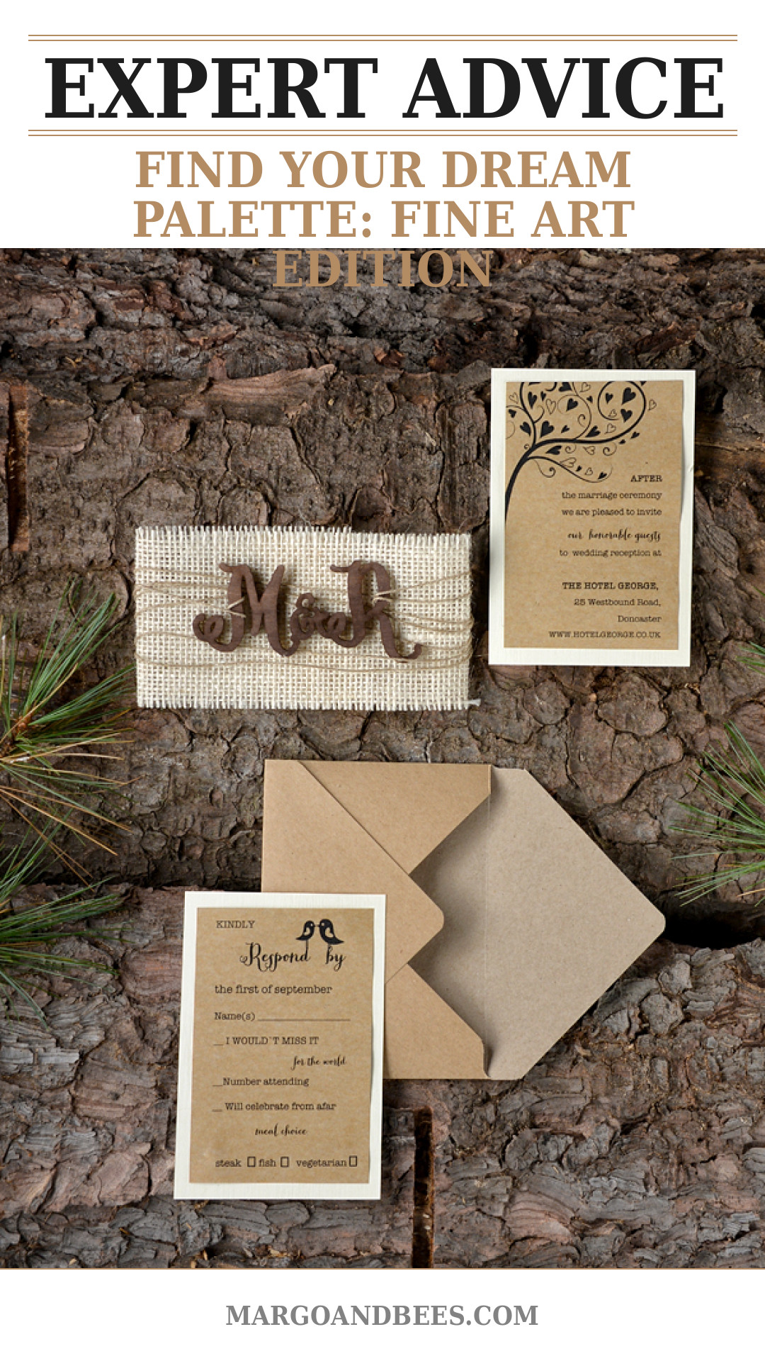
Coordinating Colors With Wedding Stationery
The Role of Invitations and Save-the-Dates
Your invitations are the first glimpse guests get of your wedding style. Using your chosen color palette in stationery design ties the event together and builds excitement.
Design Trends for 2026 Wedding Stationery
Minimalist layouts featuring watercolor effects, hand-drawn florals, and metallic foils dominated by 2026 color trends make invitations an artful keepsake. Consider layered papers to bring depth and texture that echo fine art inspiration.
Working With Professional Designers
Collaborate with trusted designers like those at Margo and Bees who specialize in bespoke wedding stationery that beautifully incorporates your palette, ensuring a personalized and cohesive look.
Enhancing Guest Experience Through Thoughtful Color Planning
Creating Atmosphere and Ambience
Your color scheme influences guests’ emotional experience. Soft pastels lend serenity, while daring jewel tones suggest celebration and glamour. Matching decor to your palette enhances the venue’s aesthetic appeal.
Color Psychology in Seating and Lighting
Use color strategically—for example, calming blues at dining areas or warm lighting to complement gold tones—increasing comfort and social connection among attendees.
Extending Colors to Attire and Accessories
Encourage bridal party outfits, boutonnières, and accessories to echo your palette. This holistic approach creates a consistent visual story celebrated throughout your wedding journey.
Discover the 2026 wedding color trends and find the perfect invitations to match at Margo and Bees
FAQ
How do I choose the right wedding colors for my personality?
Consider your favorite colors, the mood you want to create, and how your choices will look across different wedding elements. A good starting point is exploring palettes that inspire you at Margo and Bees.
When should I decide on my wedding color palette?
Ideally, choose your colors early in the planning process—around 9 to 12 months before the wedding—to ensure consistency across decor, attire, and stationery.
How much does coordinating wedding colors with stationery cost?
Costs vary depending on design complexity and materials. Bespoke invitations from designers like Margo and Bees offer packages to suit diverse budgets while delivering high-quality, unique pieces.
Can I mix fine art-inspired tones with vibrant colors?
Yes, mixing muted and vibrant hues creates dynamic contrast and visual interest. To get a balanced look, use vibrancy as accent colors against a fine art-inspired base.
What interior design trends are influencing wedding colors?
Earthy neutrals, layered textures, and biophilic-inspired palettes are currently popular, bringing natural warmth and modern sophistication to wedding color schemes.
How can I ensure my wedding colors look good in photos?
Choose hues that complement your venue’s lighting and surroundings. Consult with your photographer and see examples of color usage in wedding galleries like those at Margo and Bees.
Embrace the creativity and emotion behind the 2026 wedding color trends and start designing your celebration with confidence. For beautiful, on-trend invitations and stationery, visit Margo and Bees – your partner in crafting unforgettable weddings.
#wedding #bridetobe #weddinginvitations #weddinginspo #weddingdecor #2026weddingcolors #fineartwedding #weddingpalette #weddingplanning
Check out this product from our collection: 05/BRque/z25
You might also love: 26/wood/z